Designer tip. “The trick to small spaces is truly that less is more,” Marzella says. “By minimizing the number of finishes and transitions from one material to the other, there are fewer visual interruptions in this space. This is both pleasing to the eye and creates the illusion of more space. The gray herringbone mosaic tile floor runs from the main floor and through the shower. This further expands the space by unifying it, as opposed to breaking it up with two finishes. The vanity is wall-mounted so the space feels more open. By having this float off the floor, the tile disappears into the shadows as opposed to stopping at the front.”
Neko sconce: Mitzi by Hudson Valley
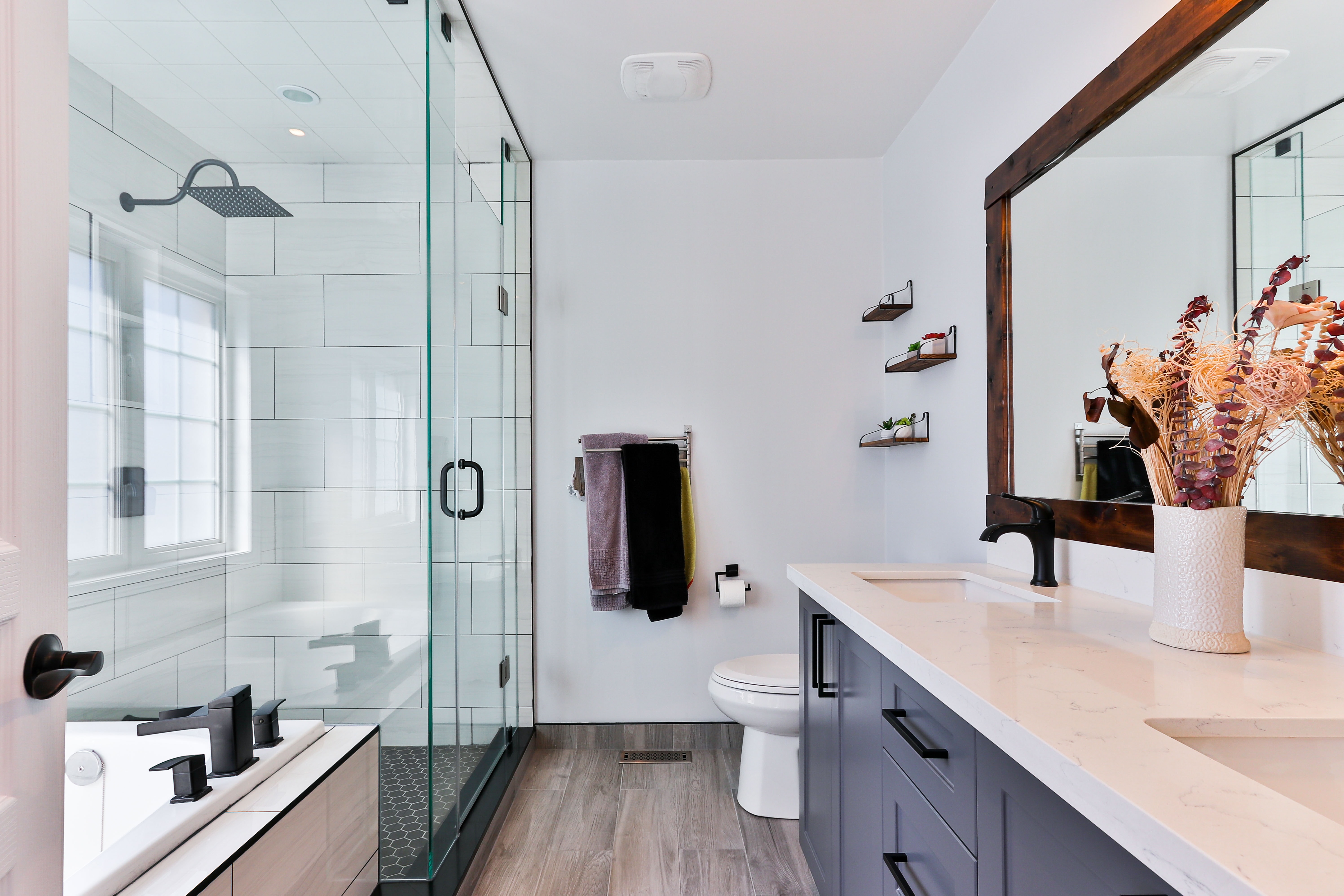
Designers: Heather Sanders and Aurora Morris of Shelterwerk
Location: Oakland, California
Size: 49 square feet (4.6 square meters); 5 feet, 10 inches by 8 feet, 4 inches
Homeowners’ request. “The original bathroom layout felt cramped and blocked light from the existing window,” designer Heather Sanders says. “There was no storage, and the mauve tile was dark and dated. The homeowners wanted to modernize the space and maximize light and storage.”
Visual trick. “Glass shower doors allow a lot of light, which is maximized by the glossy white finishes and ample mirrors of the oversized medicine cabinet,” Sanders says. “The wall-mounted toilet and vanity make the space feel more open.”
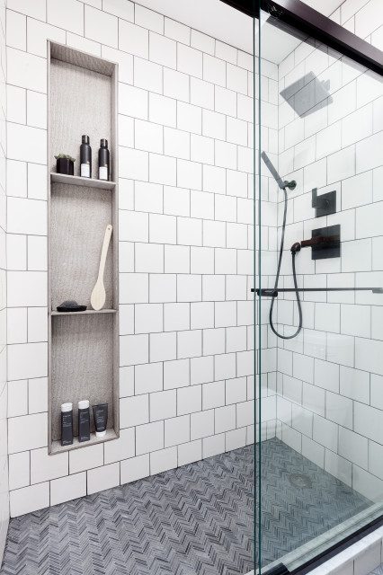
Other special features. “The linear niche is the most significant design detail in the room,” Sanders says. “It continues along the entire wall, even into the shower, which ties the space together and provides much-needed, convenient storage. The wood-lined recessed niche lends a lot of warmth and adds an unexpected material into the bathroom.”
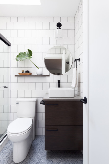
Designer tip. “It’s important to pay special attention to the transitions between materials and the way that they align to create visual simplicity in a complicated room,” Sanders says. “Installing a toilet that has the tank hidden in the wall keeps the floor beneath clear and makes for easier cleaning.”
“Uh-oh” moment. “Coordinating all of the recessed items and getting materials and products to align proved very challenging within the existing construction,” Sanders says. “In older homes, nothing is straight and the framing is shallow, so there’s not a lot of room for error. Everyone from design to construction needs to familiarize themselves with the products proposed early on, ideally before they get ordered and definitely before they get installed. We found ourselves adding 2-by-6-inch framing into an existing 2-by-4-inch wall to give ourselves the extra room to get the toilet and niche in. It worked out, because it also allowed us to create a standard-sized tub alcove.”
Designer: Carl Mattison Design
Location: Atlanta
Size: 40 square feet (3.7 square meters); 5 by 8 feet
Homeowners’ request. A new en suite bath for a nanny or an overnight guest in a large house built in 1910. “We wanted to give it some ‘vintage today’ appeal and simple function,” designer Carl Mattison says.
Visual trick. The vanity is the same color as the countertop, allowing the multicolored hexagonal marble floor tile to stand out and keeping the eye moving to give the appearance of more space. “Having a countertop the same color as a vanity allows the multicolor floor tile to be the star and the rest be the backdrop,” Mattison says. “Adding a contrasting-color countertop would have created yet another surface to look at.”
Other special features. Mattison installed the sconces upside down for better light.
“Uh-oh” moment. “I did not initially want satin-brass knobs on the vanity,” Mattison says. “But due to an ordering error, they were already on-site, so I made the quick decision to run with it, as I do like mixed metals — which in this case gives the impression that maybe over the years someone just changed out the knobs rather than replaced everything. This way the home looks a bit more curated rather than cookie-cutter.”
Snowbound wall paint: Sherwin-Williams
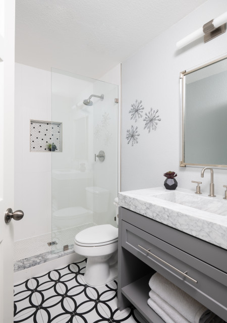
Designer: Karen Ice-Burris of Ice Interior Design
Location: Austin, Texas
Size: 40 square feet (3.7 square meters); 5 by 8 feet
Homeowners’ request. “Overall, the bathroom was dated and needed a face-lift to make it current and functional,” designer Karen Ice-Burris says. “We removed the tub-shower combo and used the space for a sleek walk-in shower.”
Visual trick. “The white tile shower surround works to enlarge the space and has a nice matte textured finish to give interest up close,” Ice-Burris says.
Other special features. “The floor pattern was the main design feature in the room and the jumping-off point for the other selections,” Ice-Burris says. “Keeping the tile in the same colorway of black and white and playing with pattern and textures adds interest without getting too busy in a small space.” Carrara marble remnant tops the shower curb and coordinates with the Carrara marble vanity top and integrated sink.
Designer tip. “The floor-to-ceiling frameless glass panel with a fixed opening creates the illusion of more space and provides a splash guard for the wet area,” Ice-Burris says.
“Uh-oh” moment. “Our tile sample was incorrectly labeled in the showroom, and we ended up with a completely different tile delivered to the job site,” Ice-Burris says. “We have a great working relationship with our vendors, and they were quick to remedy the situation with expedited delivery of the correct tile at no expense to us, minus the heart attack. Our vanity also arrived on-site with a damaged drawer. The replacement was going to take longer than we wanted to wait. Fortunately, our client was handy and able to repair the drawer — crisis averted.”
White Heron wall paint: Sherwin-Williams
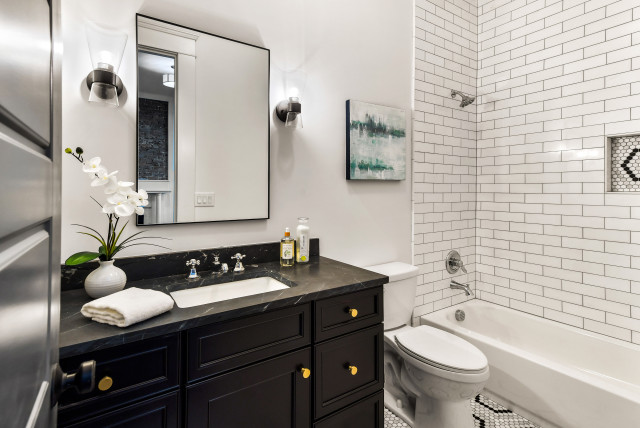
Designer: Larisa Barton of Soeur Interiors
Location: Brooklyn, New York
Size: 43 square feet (4 square meters); 5 feet, 4 inches by 7 feet, 11 inches
Homeowners’ request. “We remodeled this entire apartment for a father and his two children,” designer Larisa Barton says. “He wanted a total refresh of this bathroom for them. The bathroom started out dark brown with muted tiles and little storage. The main goal was to lighten everything up and make it more functional.”
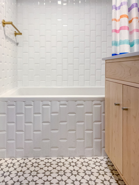
Visual trick. Beveled white subway tiles run vertically to visually expand the height of the room.
Designer tip. “Budget was really a concern for my client, so we decided to keep the existing layout in order to save on labor,” Barton says. “We also expanded the vanity area, because the original vanity and mirror were too small for the space. This made the room look bigger and increased the functionality.”
“Uh-oh” moment. “We originally had planned to use all brass hardware — shower, shelves, faucet, etc.,” Barton says. “My client was very overwhelmed with the look when he saw everything. To tone the aesthetic down a bit, we implemented a mixed-metal look with brass lighting and towel bars but chrome faucets. Additionally, we changed the shelves to fun white ones.”
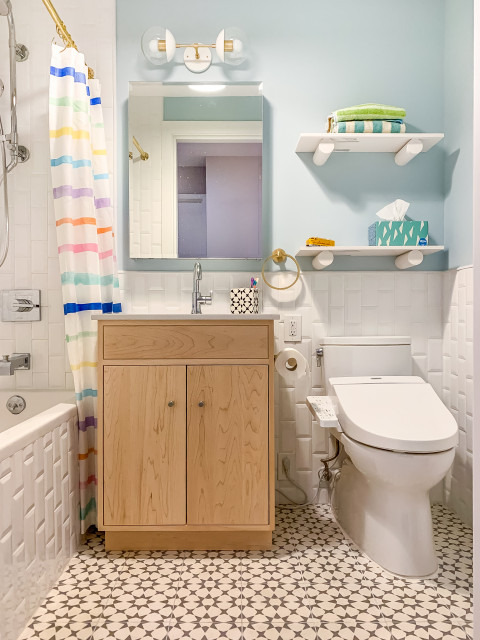
Designer: Gianna Marzella of Gia Mar Interiors
Location: Fresh Meadows neighborhood of Queens, New York
Size: 37½ square feet (3.5 square meters); 5 by 7½ feet
Homeowners’ request. Open up, modernize and brighten a dated, dingy bathroom.
Visual trick. Square white tile covers all the walls from floor to ceiling. “Treating the whole wall, as opposed to tiling only part of the walls, creates unity and makes the space feel larger,” designer Gianna Marzella says.